Bringing an artful elegance to this refreshingly simple hotel’s look, feel and tone.
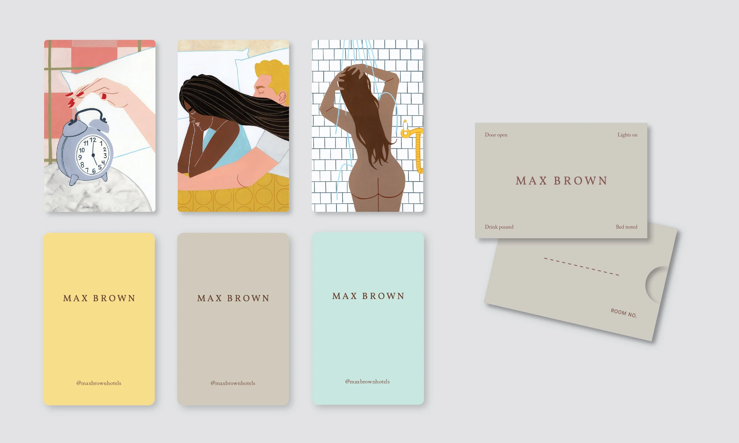
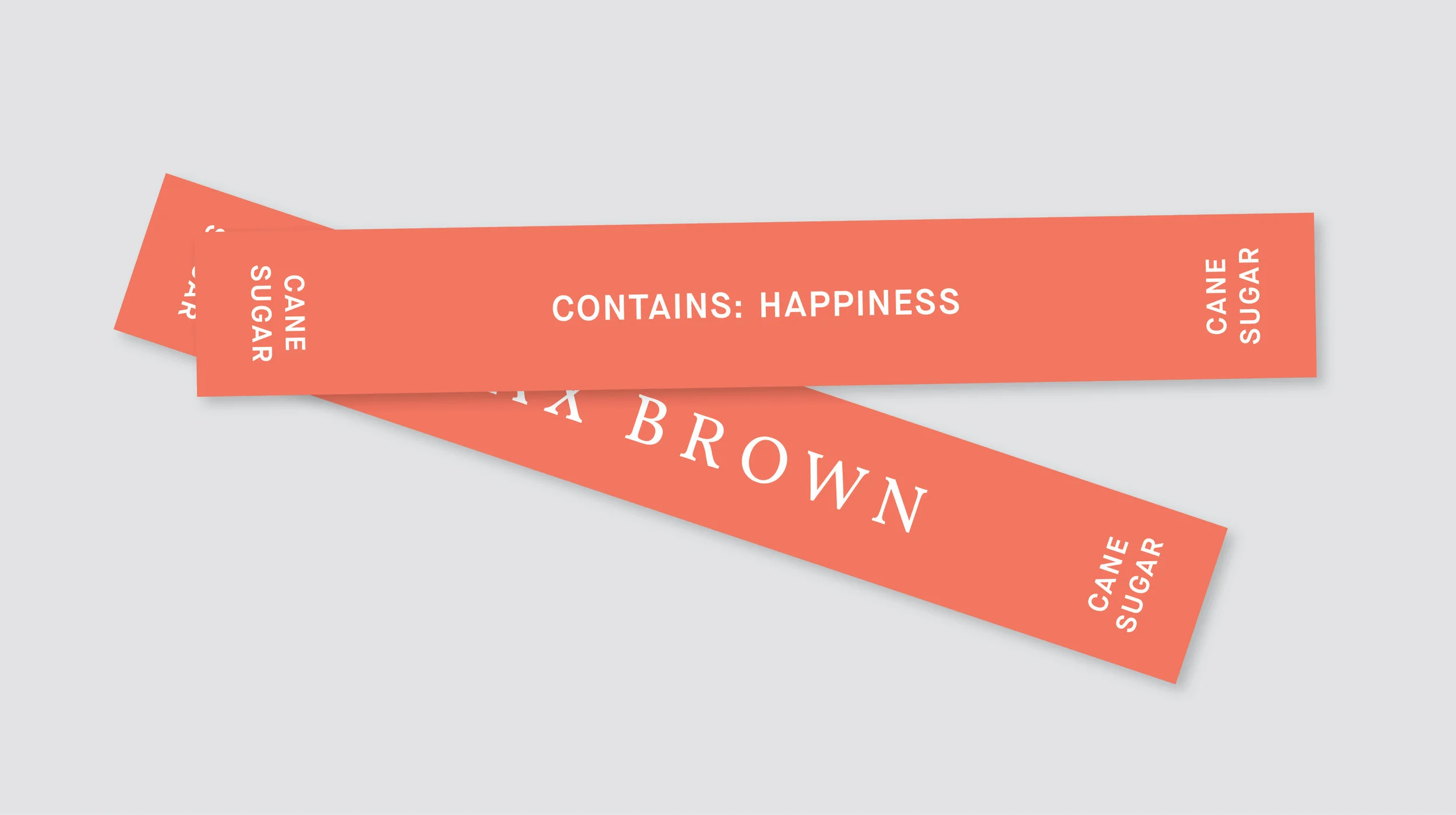
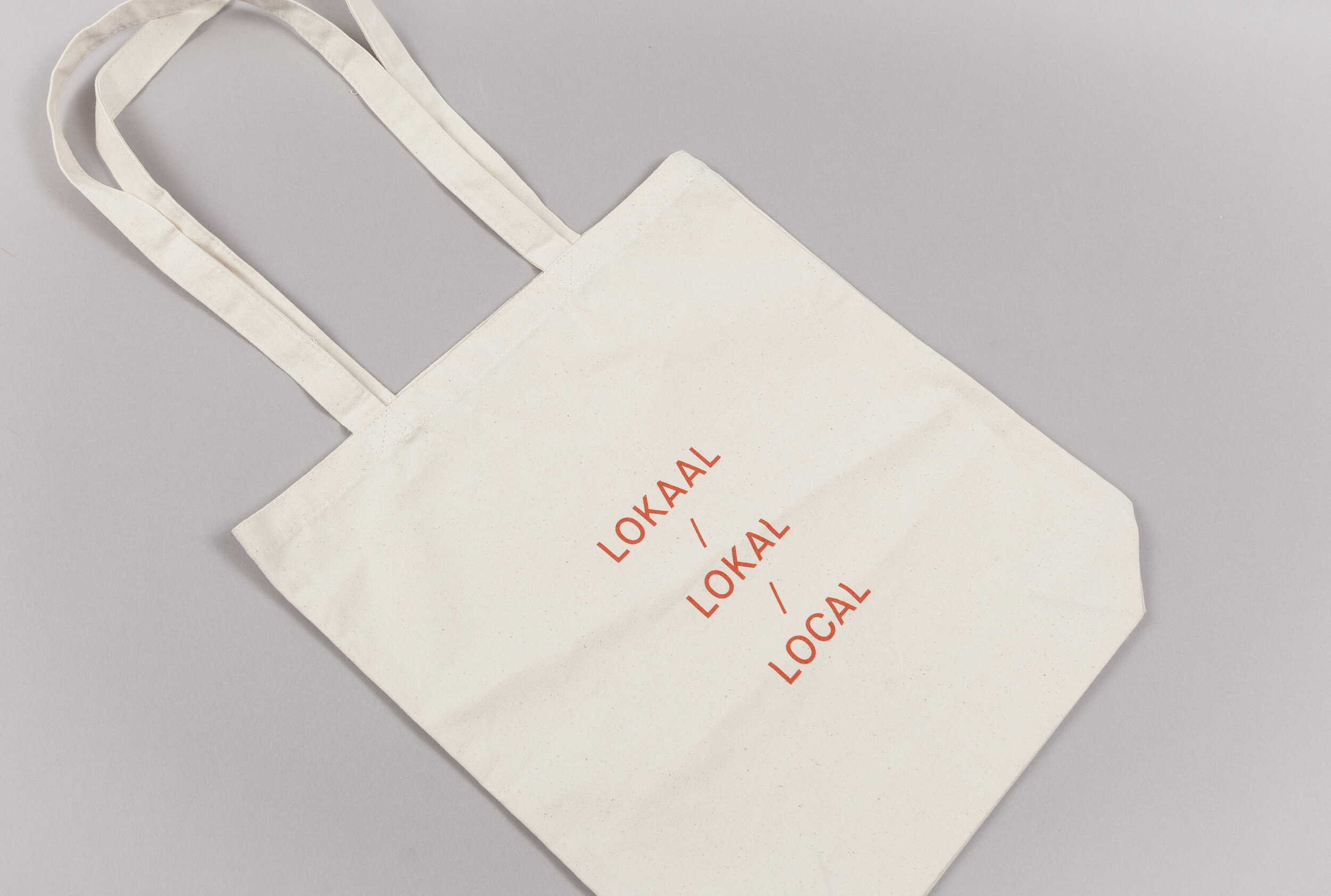
Studio Lidderdale refreshed and evolved Max Brown’s brand, creating a new visual identity, illustrations and photography, as well as simplifying and refining the logo. The boutique hotel chain prides itself on bringing great design and a local charm to the neighbourhoods where they’re situated. They skip many of the costly (and often unused) extras that other, more pricey hotels offer, opting to instead bring unrivalled quality to the essentials. The modern design reflects this elegant simplicity with an unassuming charm aimed at attracting a diverse crowd who appreciates great design and is too smart and savvy to overpay for an unnecessarily “fancy” hotel.
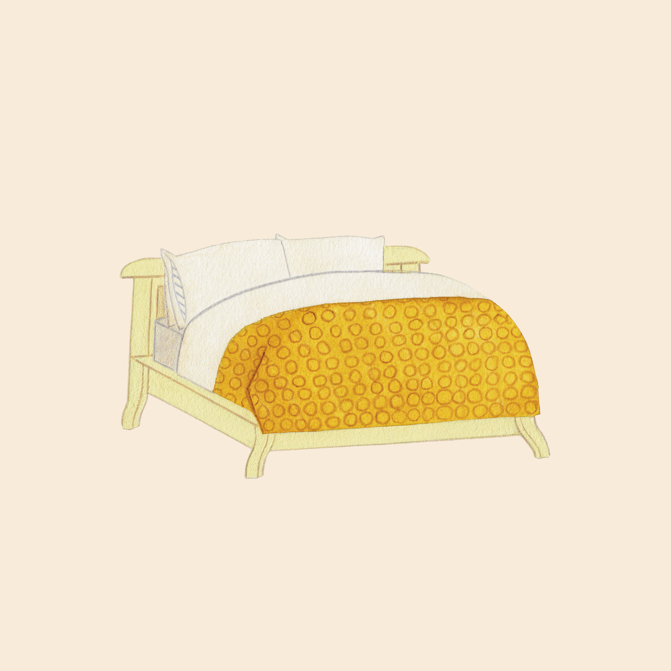
ILLUSTRATIONS
PHOTOGRAPHY
EMAIL CAMPAIGNS
Creative Direction, Art Direction, Graphic Design: Studio Lidderdale
Illustrations: Kelly Bjork
Photography: Marie Wanders
