ADVENTUROUS BRANDING FOR SECTION L,
A HOTEL IN THE HEART OF TOKYO
Studio Lidderdale created the brand strategy, art direction and visual identity for this uniquely inspiring Japanese hotel.
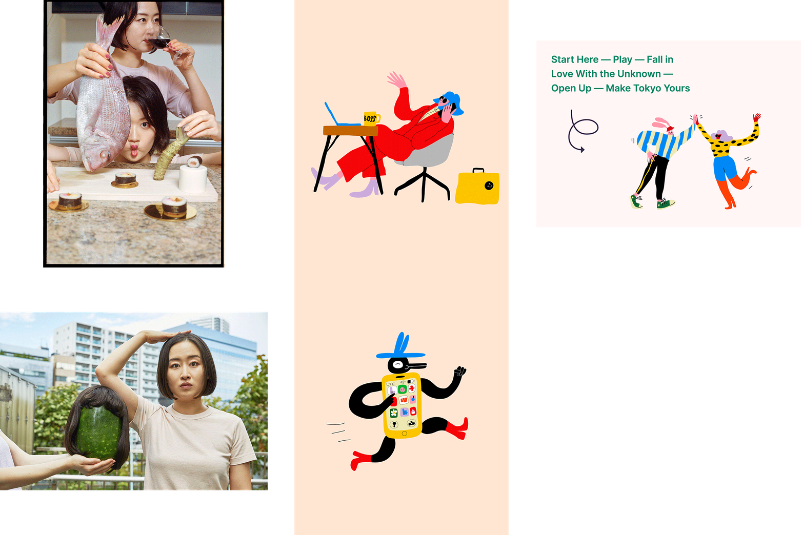
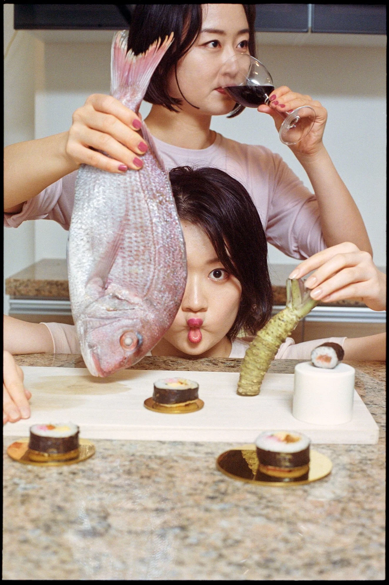
This included positioning Section L in a fresh and inspiring way for modern travellers. The place where it all starts. A gateway to something fresh. A springboard to the unknown. We built the strategy and creative around a “choose your own adventure” approach — inspiring people to embrace the happy accidents and experience the city on their own terms. We created everything from photography and illustrations to a comprehensive guide for experiencing Tokyo the Section L way.
Section L Project Credits
Identity, Design & Art Direction: Studio Lidderdale
Photography: Tetsuya Maehara
Illustration: Egle Zvirblyte


